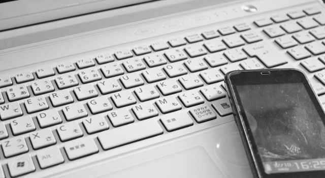
[WEB attracting] Differences between PC sites and smartphone sites
May 12, 2022 Technical SEO , usability , site construction / operation , UI / UX
Do you know how much your smartphone penetration rate is?
According to the Cabinet Office "Consumer Trend Survey", the penetration rate of smartphones in Japan is 54.7%.
An era where you can browse sites, do online shopping, and complete everything with smartphones.
Smartphone support is no longer essential!
This time, I would like to introduce some points to be aware of when making a smartphone support.
Be aware of the usage scene
Assume that you can browse the site on your desktop PC.
You can assume some limited scenes, such as office and home study.
So what about smartphones? Are you commuting? Between housework? Reception waiting time? Can't you imagine various scenes?
Smartphone sites require that the priority and UI design of this "scene" and "what kind of action the user takes" is required.
For example, "Restaurant Word -of -mouth Site"
PC users are the purpose of "menu" or "word -of -mouth" purpose?
Do smartphone users want to know the "Map to the store" or the "reservation phone number"?
Find out what users are looking for in these scenes and give priority to content.
Difference in screen size
As a matter of course, the screen of the smartphone is very small compared to the desktop PC.
If you try to put all the same information as a PC, it will be a long and very difficult page ...
It will be very important to put together the information here!
No matter how good the content is, it doesn't make any sense if the user leaves ...
Let's consider the screen design with the following criteria
Concisely
There is no user who wants to read a redundant text as simple as possible.
Easy to see
Is the character size and line space OK? Is the button easy to press?
Boldly
Let's put only the content that users really need without any extra modifications.
Also, look at the following guidelines.
・IOS Human interface guidelines
3. Difference in line speed
Smartphones have a great line speed depending on the environment.
It's the main cause of slow loading, loading, and user withdrawal.
In order to avoid such a thing as much as possible, try to make the image loseless compression, the parts that can be expressed in CSS are CSS as much as possible, and the long JavaScript etc. are compressed to the code, such as compressing the code.
4. Finally
The UI has also evolved along with the popularity of smartphones.
However, isn't it really important to always keep in mind "when is the user easy to use?"


![[THE May 2022 Core Update] Google announces the first core update in 2022!](https://www.seostyle.net/esuio4587/wp-content/uploads/2022/05/23628486_s-75x75.jpg)
![[Site operator must see] What caused the ranking drop? How to release the penalty type and how to cancel it?](https://www.seostyle.net/esuio4587/wp-content/uploads/2022/05/4925517_s-75x75.jpeg)
![[November 2021 Local Search Update] Local search update](https://www.seostyle.net/esuio4587/wp-content/uploads/2021/12/5002701_s-1-75x75.jpeg)


