This article summarizes what kind of mobile -friendly is specifically explained, and how to respond to sites that are not mobile -friendly.What is mobile friendly? What is the difference from Mobile First Index (MFI)?
Mobile friendly is the name of Google's notification on February 27, 2015 and announced on April 21, as the number of smartphone users has increased. The mobile version search results have raised the posting ranking of mobile -friendly pages . (However, even if it is not a mobile friend, it seems that it may be displayed in high ranks if it is a highly relevant page.) Google has listed the following three features of this update.
・ It affects only the posting ranking of search on mobile terminals
・ Affects search results in all languages around the world
・ Each page is eligible, not the entire website 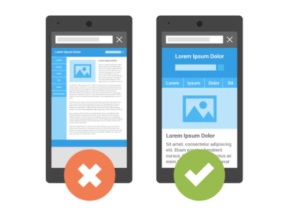
(Source, quotation: official blog for Google webmasters )
As you can see from the images of Google as an image, it is important that the layout is easy to read even on your smartphone The content of the mobile -friendly update was that the site that is easy to see and understand when searching from a smartphone is added to the new evaluation criteria when searching from a smartphone The mobile first index update with a very similar name means that Google's index or crawls based on PC content are changed to Cooks and Crawl based on smartphone content. Be careful not to confuse it because it is an update content. (Click here for detailed articles about Mobile First Index)
● Why did Google perform a mobile friendly update?
The story returned to Mobile Friendly, why did Google perform a mobile friendly update? This explanation is given on the 2016 webmaster official blog.
"No matter what device you use, Google thinks that accurate and relevant search results should be displayed. The search results are accurate, no matter which smartphone, PC, or tablet is used. It should be easy to see, and from this May, we have started using a mobile search element from last year. Updates to increase the algorithm will be more likely to be viewed in the search results.
Google always aims to display search results according to the user intention. In the mobile -friendly update, the update of the smartphone -compatible site has been updated in the background of search demand from smartphones. According to the Ministry of Internal Affairs and Communications data as of 2019, the status of information and communication equipment in households was "mobile terminal" (96.1%), of which 83.4%for "smartphones" and 69.1%for "PC", with a smartphone presence. Is becoming more and more strong. (Reference: The holding status of the Ministry of Internal Affairs and Communications information and communication equipment )
Google would have been in anticipation of such a smartphone spread. In 2018, he announced the launch of a mobile first index to use the index standards to mobile.
● What should I do to support mobile first friendly?
Google is a mobile friendly test as a way to check if your site is mobile -friendly or what you need to do to make it a mobile friendly. Is provided. ( To Mobile Friendly Test )
You can diagnose just by attaching the URL of the page you want to check, so be sure to check it.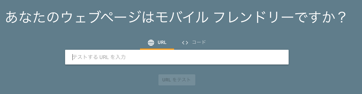 (Source: Mobile Friendly Test) It is determined whether the page is a mobile friend or mobile friendly, and if it is not a mobile friend, an error element is displayed.
▽ If there is no problem (example)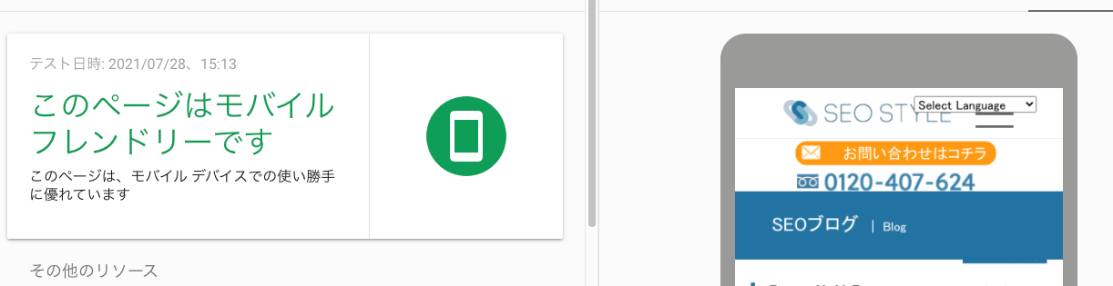 ▽ If there is any problem (example)
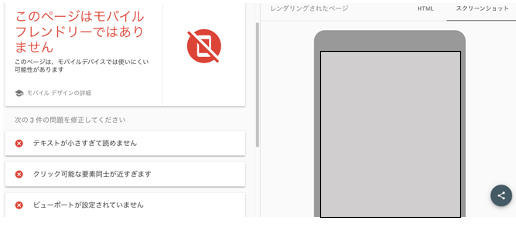
The following six items for error detection are as follows.
1. Uses compatible plugins (displayed when plug -ins that is not compatible with mobile browsers.)
2. The view port is not set (the viewport is a display area in Japanese, how to display it for different screens such as smartphones, PCs, and tablets. It is to say).
3. The view port is not set so that it fits in the "terminal width" (almost the same content as No. 2, but it is highly likely that the viewport settings have been set correctly according to the width of each device. is.)
4. The width of the content exceeds the width of the screen (Occasionally, there are sites where the image size is too large when viewed on a smartphone, but it is in that state.)
5. The text is too small to read
6. The clicking elements are too close to each other
To put it simply, searching from smartphones is increasing year by year, so it is also an important evaluation factor in a site that allows users to obtain the information you want to know without any discomfort or inconvenience when you look from your smartphone. That's right.
How do you deal with mobile friendly?
Unfortunately, Google also shows how to do it if you are diagnosed as "not a mobile friend" in the mobile friendly test, so let's deal with it one by one.
1. If you use a compatible plug -in, if you come out, "Plugins (such as Flash, etc.) that are not supported by most mobile browsers are included on the page. We recommend that you redeem the page using web technology .
2. If the view port is not set, if it comes out, "The ViewPort property is not defined on the page. This property instructs the browser to adjust the size and scaling of the page according to the screen size. Therefore, the user who accesses the site uses a different screen size, such as a large desktop monitor or a small smartphone. Please see the basics of responsive web design.
3. If the view port is not set so that it fits in the "terminal width", it will not be adjusted according to different screen sizes because the page is defined on the page. To fix this error, set a responsive design on the site and set the viewport correctly to the width of the device.
4. If the content width exceeds the screen width, "This report shows a page that requires horizontal scrolling to display the phrase or image on the page. This error is, this error. It occurs when using the absolute value in the CSS declaration or the page is designed to be optimally displayed in a specific browser width (such as 980px). Use the relative width and position value for the CSS element of the page, so that the image can be scaled in the same way, please refer to the article about how to match the size of the content to the viewport. "
5. If the text is too small to read, "This report shows a page that the font size is too small to read the letters, and the mobile user must pinch and enlarge. After specifying the web page viewport, you can see how to use the font size for the font size for details in the viewport. "
6. If the clicking elements are too close to each other, "In this report, the mobile user uses fingers without tapping the adjacent elements because the tap elements such as buttons and navigation links are too close to each other. To fix the URL of the site that is not easy to tap, set the button and navigation links to the mobile user. See Adjust the size of the tap target properly.
What is responsive design?
you can see that Google recommends responsive design Google Search Central also states why you recommend responsive design, so Google seems to recommend that you introduce a responsive design on the site, but do you know what the responsive design is in the first place? Responsive design is to set the display of the site to make it easier to see and make it easier to see according to different terminals such as personal computers, smartphones, and tablets. By introducing responsive designs on the website, you can automatically switch the content of the same content to display the terminal used by the user. Because there is only one URL, it is easy to understand the content by the user, and for Google's algorithms, it is not divided into the URL / PC URL of the mobile site, so it is easy to understand because it is easy to understand because it is easy to understand. It has the advantage of being indexed. (Click here for details. Google Search Central: Reasons to make it a responsive design )
● [Duplicate attention] If it is a separate URL on a personal computer and mobile, if the content is the same
On sites that do not have responsive designs, you may have prepared separate URLs on PC sites and smartphone sites and adjusted the design. In that case, take the right to communicate the relationship between both sides. If you do not deal with it, you may be a duplicate content with multiple pages with the same content on one site.
-Duscable evaluation due to duplicate content is distributed and the search results are not stable ... If there are multiple content with the same content, different pages are evaluated for each update or fluctuation, which may lead to sudden fluctuations in the ranking.
-In some cases, the possibility of the penalty is also determined to operate a malicious site that impairs the convenience of users, which intend to operate the ranking and increase traffic, intentionally describes the same content on multiple pages. If it is done, it may be a penalty target. How to deal with each other, so let's declare that this smartphone site is a smartphone version of a PC site called A, so that this smartphone site will be correctly indexed on the search engine and will be evaluated regardless of PC or smartphone. It will be.
-The use of Canonical attribute is a tag used to normalize the URL. For example, one of the items that is important as an internal element of SEO, "www." Is one of the normalization of the URL. If it is necessary for a site with a large amount of content and there is a duplicate page, it is troublesome if the search engine is processed as a duplicate page. In such a case, the canonical tag is used. If you have duplicate content (content with almost the same content), you can specify the page you want to display in the search result preferentially. (Click here for detailed explanations * We are now preparing)
If you don't know how to deal with mobile friendly, you want to move to a responsive design, but it's difficult to make a decision, please consult SEO STYLE. In addition to mobile friendly elements, you can analyze your site from the SEO as a whole, create sites that are conscious of improvement advice and SEO measures other than responsive design . ( First, let's consult. )
● What is a smartphone site design that captures user psychology?
Until now, we have explained mainly the indicators of Google about mobile friendly, but the indicators indicated by Google should be clearly cleared, and there are various UIs for creating an attractive site that beats a competitive site.・ It is important to proceed with the site design in consciousness of UX. What do you need to be aware of? Here are some simple examples of site improvement. First of all, the smartphone user is "impatient". You may not have time to read the text slowly.
・ It is necessary to simply communicate your strengths. In smartphones where the screen is small and the characters tend to be small, you do not read the text suddenly. At first, you need to make you think, "I want to read more." Rather than writing on average "I can respond to various projects!" Let's create a solid story, assuming how smartphone users will see the site.
・ You can call immediately. I can email. Let's make such a state. The biggest weapon of the smartphone site is that you can call immediately. This works especially effectively in the case of an urgent situation.
For example ... When a user flows into the page from a search engine (Google) with the keyword "debt consolidation judicial scrivener"
Improvement example
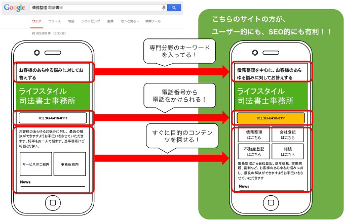 As shown in the figure above, it is important to clarify the purpose and summarize it in a configuration that allows users to know what to do next. As an example, there are various other elements of UI / UX that must be suppressed, but I think that even if you are a little conscious of this, you can see that the impression of the site changes dramatically.
summary
Mobile First Index (MFI) has also started, and smartphone measures are increasingly important . It is expected that measures will be required not only for the contents of the mobile friendly test but also in a wide range of UI and UX. SEO STYLE proposes a site design that considers user psychology, assuming SEO measures such as mobile -friendly . We also have a simple diagnosis of your site, so please consult us at this opportunity. < Serial diagnosis of the site >


![[THE May 2022 Core Update] Google announces the first core update in 2022!](https://www.seostyle.net/esuio4587/wp-content/uploads/2022/05/23628486_s-75x75.jpg)
![[Site operator must see] What caused the ranking drop? How to release the penalty type and how to cancel it?](https://www.seostyle.net/esuio4587/wp-content/uploads/2022/05/4925517_s-75x75.jpeg)
![[November 2021 Local Search Update] Local search update](https://www.seostyle.net/esuio4587/wp-content/uploads/2021/12/5002701_s-1-75x75.jpeg)


