In this article, what is the Mobile First Index (MFI), which announced the official start in 2018? From the explanation of the mechanism, it summarizes how to check your site, its impact and countermeasures.What is Mobile First Index (MFI)?
The launch of the mobile first index was announced on March 27, 2018.
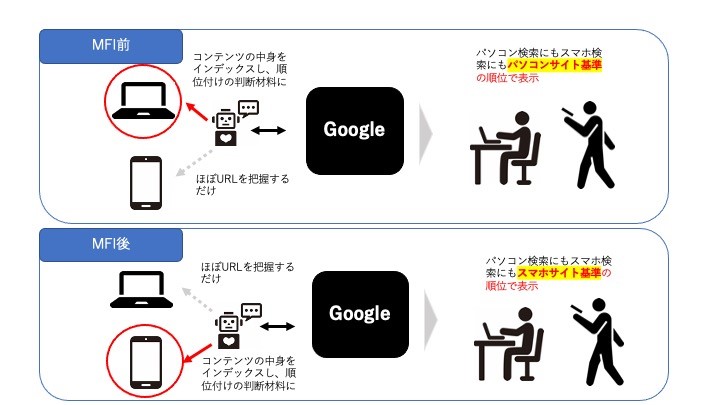
“So far, Google's crawl, index, and ranking systems have mainly used desktop content, so if the content is significantly different from the mobile version, it may cause problems with mobile search users. There is an index that uses a mobile user to find a mobile user for search results, which are mainly used for indexes and rankings. There is no "Mobile First Index" from the main index. Historically, desktop content content has been indexed, but we will use mobile content content in the future. (Quotation: Official Blog for Google Web Master )
Until now, the desktop version (PC version) content was used in crawls, indexes, and ranking systems, but in the future these standards will be a mobile version (smartphone version) . It is important to note that the evaluation criteria will be replaced, so if you have not looked at the smartphone or not much to the content.
● Why did Google take a mobile first index?
Google is always aiming for a search engine that is close to user needs.
“Recently, most users who use Google searches have been searching from mobile devices, but the Google ranking system is still related to users using desktop content. This method is evaluated in this method, which is a matter of a mobile search user actually looking at the content of the mobile version of the page. This is because the algorithm is not evaluated (quoted: official blog for webmasters )
As you can see, in response to the current situation where the number of smartphone users is increasing, the situation in which the convenience of users that Google values is partially inhibited by the lack of a page for smartphones or difficult to see is improved. It seems that he made a big change to do.
● Was smartphone support not important so far?
Isn't the increase in smartphone users for a long time? I think that Google has never ignored the demand for smartphone users. We also evaluate whether the site is mobile -friendly or not, and in search from smartphones, we make adjustments such as displaying mobile -friendly sites. (Please see this article for explanation of mobile friendly elements and mobile friendly tests.: To the mobile friendly article) However, these were only rated elements, and the standards were computer content. In light of the spread of smartphones worldwide, there are more smartphone search than PC search, so the standard for evaluation has become a smartphone from a personal computer.
● What happens if you don't have a smartphone with only a personal computer site?
Please be assured that there is no index even if you do not support smartphones. However, Google says that sites that are highly associated with search will be ranked higher even if they are not mobile -friendly, but there is no doubt that the ranking will be affected. We recommend that you start smartphone support as soon as possible.
Has your site migrated? Let's check the index crawler and make a mobile friendly diagnosis.
Let's check if the index of your site is GoogleBot for smartphones or GoogleBot for PC. Confirmation of migration can be performed from Google Search Console. You can check the index crawler by checking the outline of the settings. 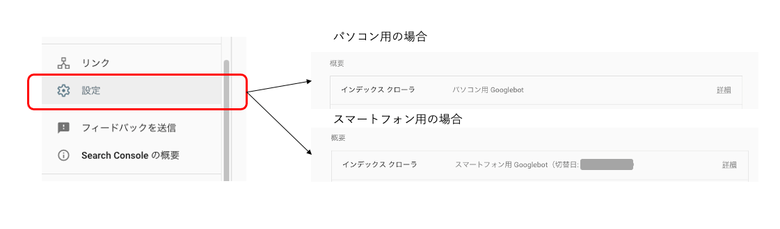
● When your company's site is still a GoogleBot for PC
If your site is still a GoogleBot for PC, you may be worried. First, let's check the status of mobile first index registration. (Google Search Central: Recommended Mobile First Index registration ) If there is no particular problem, let's wait for the migration to start.
Mobile First Index (MFI) What is the effect of a complete migration? What are the measures?
What will happen by shifting to a mobile first index? As we have explained so far, the criteria for Google's crawls will be mobile, so if you are not focusing on the mobile page or are not conscious of the UI / UX when the smartphone is displayed, the evaluation can be reduced. There is a gender, conversely, the site prepared in advance will not have that much effect. Here are the features of sites where the evaluation may decrease. Check the current situation of your site from this perspective.
- It is not a mobile friendly, such as small letters, collapsed layouts
- There is a difference in content between personal computers and mobile (PC content is more substantial)
- The layout is completely different between personal computers and mobile (not responsive design)
- The structured data markup is not distributed in the mobile version (structured data test is possible here. Google official: Structured data test tool )
Of course, not only improving the above features, but also improving UI and UX and making it more important for users to make a site design and content that can be conveyed in a way that can be easily viewed and easy to understand.
SEO STYLE is receiving free diagnosis and consultation on the site
SEO STYLE's free diagnosis diagnoses not only UI / UX, including smartphone compatibility, but also requirements for SEO measures such as the appropriateness of keyword selection and site structure. Please use it to review your site. < Click here for consultation on simple diagnosis >


![[THE May 2022 Core Update] Google announces the first core update in 2022!](https://www.seostyle.net/esuio4587/wp-content/uploads/2022/05/23628486_s-75x75.jpg)
![[Site operator must see] What caused the ranking drop? How to release the penalty type and how to cancel it?](https://www.seostyle.net/esuio4587/wp-content/uploads/2022/05/4925517_s-75x75.jpeg)
![[November 2021 Local Search Update] Local search update](https://www.seostyle.net/esuio4587/wp-content/uploads/2021/12/5002701_s-1-75x75.jpeg)


