News check for commuting time, enjoy entertainment during gap time, shop, search for recipes, buy travel tickets, find out unknown words ... smartphones are becoming indispensable in our lives. You always want to be aware of attracting customers from smartphones. This time, I will explain how to respond and the points to be conscious of smartphones on websites that are growing.What is smartphone optimization? What is its importance?
The optimization of a smartphone is to make the website easy to understand when viewed from a smartphone.
In recent years, users have been doing various things on smartphones, from everyday contact to research and shopping. In fact, the penetration rate of smartphones is 83.4 % as of 2019, exceeding the penetration rate of 69.1 %. ( From the Status of the 2nd Information and Communications Equipment of the Ministry of Internal Affairs and Communications )
Google is also capturing such users, and a mobile friendly test that is a mobile -friendly when the website is seen from a smartphone. Introducing and changing the index target from a PC site to a smartphone site, a mobile first index (MFI), and a quality evaluation guideline that evaluates whether the search results match whether the search results are matched to the smartphone user's search intentions. Masu.
In this way, it is very important to optimize your website from the perspective of considering the actual situation of the user and from the SEO measures.
▼ Related articles are here
-Explanation
tests that you can know the status of the current site -2021 Finally rollout! Description of Mobile First Index
・Explanation of quality evaluation guidelines that shows what Google is emphasizing
How to optimize smartphones and site?
What should I do to optimize my smartphone?
First of all, it will not be a story unless the website supports smartphones. To do so, there are two types of methods: a smartphone -only site and a method of adopting a responsive web design, so we will explain the features and advantages.
Prepare a smartphone -only site
The first method is to prepare a website that is conscious of the smartphone display, apart from a website that is conscious of PC display.
Both PC sites and smartphone sites are prepared and automatically switches the site displayed by the user's terminal.
Advantages and disadvantages to prepare a smartphone -only site
Benefits: Because it is a smartphone -only site, you can pursue only the easy -to -view smartphone.
Disadvantages: It is necessary to manage the two sites, a PC site, a smartphone site, and it takes time to update.
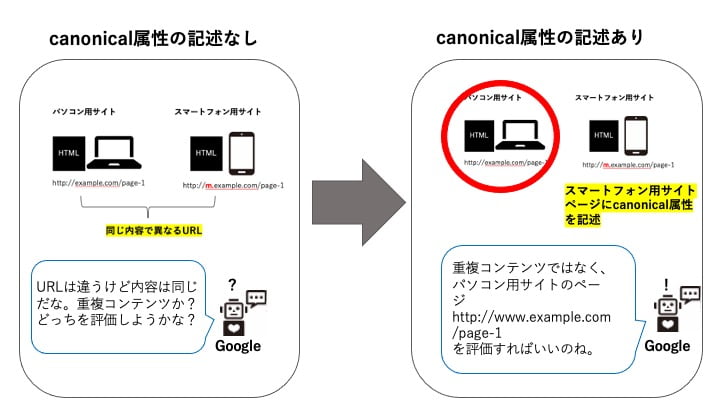
Also, be aware that if you do not set the relationship between the PC site and the smartphone site to Google, it will be recognized as duplicate content or similar content.
Canonical attribute and Alternate attribute
The relationship between the PC site and the smart site can be transmitted to Google with tags, REL = "Canonical" elements, and REL = "Alternate" elements.
● Canonical attribute
REL = "Canonical" element is used for "normalization of URL". Although the page with the same content is multiple URLs, you can evaluate this URL and tell Google. If you have a personal computer site and a separately available site for smartphones, you can use other explanations with different colors and sizes on the EC site.
In addition, "normalization of URL" can be prevented from dispersion of link exchange.
▽ Canonical attribute description example
● Alternate attribute
REL = "Alternate" elements indicate that there is a page prepared separately from the display page, as the meaning of Alternate. It is used when the contents are the same but the URL is different. If you have a site dedicated to smartphones like this time or if you change the language depending on the country, this tag is a substitute URL of the PC site (smartphone site page). You can tell Google that there is.
▽ Example of description of Alternate attribute
● Canonical attribute, precautions of Alternate attributes
・Describe in HEAD element,
describe the Canonical attribute and Alternate attribute in the head element. If it is described in the Body element, it will be ignored by Google.
・The relationship between the mobile page and the corresponding PC page is one -to -one
Canonical attribute, and the alternate attribute is a separate URL, but the content is the same content. As shown in the following example, do not describe the Alternate attribute on the top page of the smartphone site as shown in the following example. Both descriptions will be ignored.
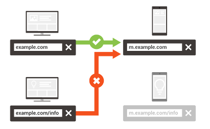
(Refer; Google Search Central Different URL )
Introducing Responsive Web Design
Another way for smartphones on websites is the introduction of Responsive Web Design. Responsive web design refers to displaying one web design according to the terminal of the user.
Advantages and disadvantages of responsive web design
Merit: The screen display on the terminal used by the user is automatically made. Unlike when preparing a smartphone -only site described in the first place, there is no difficulty in managing because it is one site or page. Similarly, the brand image can be unified because there is no difference in the design because the display method varies depending on the terminal with one design.
Disadvantages: The fact that there is no difference in the design is that if you turn it over, you cannot design for smartphone sites or design for PC sites. When viewed on each device, you have to consider the design so that there is no inconvenience.
Which is better, a smartphone site or a responsive web design?
Both have advantages and disadvantages, but recently there are relatively many sites that introduce responsive designs. If you are not confident in the management of the site or installing the correct tags, you may want to use a responsive design. Google also recommends the introduction of responsive web design, but the main reasons are that it is unlikely that the trouble will be reduced or the incorrect response.
However, it is not necessary to be here in terms of SEO, so we recommend that you consult with the production company in consideration of the budget and management system of site production.
Of course, SEO STYLE will also make a polite hearing and site diagnosis, so please contact us. <Contact>
Related article
Google Search Central; Responsive Web Design
What are the points to be aware of when creating a smartphone site?
Regardless of whether it is a smartphone -only site or a responsive web design, the points you need to consider the convenience of smartphone users will not change. From now on, we will explain what sites that are easy to see and use for smartphone users, usability and UI/UX for smartphone users.
If you are not familiar with UI/UX or user bititity in the first place, please click here first.
▽ Related articles
・Importance of usability
About usability peculiar to smartphones
・
The most prominent difference between browsing from a PC with a small screen and browsing from a smartphone is the size of the screen. Make sure that the letters are small and difficult to see. Conversely, if the letters are too large, it is a problem. It is stressful for users because the information obtained on one screen is reduced and you have to scroll over and over again.
When the website is completed, be sure to check the size of the characters when viewed from your smartphone.
Also, check the link between the links.
If the link is crowded on a small screen, you may press the wrong link. Make sure you actually operate it yourself and see if the desired link is easy to press.
・ For users, extra screen transitions
can only be seen on one screen at a time on stress smartphones.
If you can't assume it properly, you'll give user unexpected stress and you'll be more likely to leave the site.
For example, if you have a phone number, you cannot call it as it is (if you have not introduced a tap call).
Learn the phone number → Close the screen once → launch the smartphone call function → Drive a number on the keypad
and make a move.
Also, be careful when one topic goes over many pages, so you have to press it many times to the next page.
・ When considering the convenience of smartphone users peculiar to
smartphones, consider the operation unique to smartphones.
-Taps, double taps, long -press presses
, taps often press the link, double taps are expanded, long presses are often used as copying and investigating functions?
as
a user, but it flew another page! " There is a possibility that mismatch will occur. -The
movement of the scrolling fingertips can scroll the page, so long pages may be skipped.
Include eye -catching images, put in bold and highlights in important places, and make the buttons stand out.
-The pinch -in/pinch
-out function of a smartphone that can enlarge or shrink the screen only by the movement of the pinch -in/pinch out fingertips is very convenient. There aren't many points to be aware of due to the characteristics of pinch -in/pinch -out, but I am a smartphone user, such as whether the characters are blurred even if the narrow characters such as precautionary statements are pinched in. When you look at the site from the perspective, you may have a point to pinch in/pinch out, or if you have it, you can also have a viewpoint of solving the problem.
Optimize according to the purpose of the smartphone site
In order to effectively appeal on a small device such as a smartphone, it is also effective to optimize the site by focusing on the purpose . Here are the ones that Google advertising help show.
・ It is easy to check the information that you want to increase sales online
, it is easy to check the information, it is easy to purchase, such as "purchase now", and it is easy to do "easy to do"
. In terms of operation, it is not necessary for users to expand their characters or repeat the screen transition, with the consciousness of the smartphone specific as mentioned above. In terms of easy to confirm information, what is the information you want to know just before the purchase, conscious of the user's customer journey? What are the comparison elements? Think carefully and include the necessary information. For example, if it is an EC site, it may be necessary to wear images in addition to color and size information, and small items such as accessories may not be blurred even if the image is enlarged. Consider whether you can present information that will be the decisive user's decisive factor.
And let's stick to the ease of purchasing. Be aware of the introduction of a tap call, as well as a variation of payment, and preparing a button like purchasing now.
・ I want to increase the number of inquiries over the phone.
First of all, it is necessary to introduce a tap call more than anything else. Then, make sure that the tap call button is not buried in the advertising, explanation, and site design. No matter where you want to make a phone call while viewing the site, it is important to always display the tap call button while
. Be aware of how to lower the hurdle for users to call, such as posting the owner's face and posting the store.
・ If you want to increase the number of registrants who want to promote online registration
, make the registration form as simple as possible. Don't do as much as possible because scrolling and zooms will increase the possibility of input mistakes and lead to the trouble of reviewing.
・
If you want to come to the store, you need to immediately see how you want to go, or if you want to go
. From the perspective of what you want to go to, bring the in -store videos to the top, and select the content, such as narrowing the product description to one push.
In addition, let's devise a google map embedded, provide information on an image on an access page, and to make it look at the address at a glance.
In order to disseminate information, increase awareness it is important to create sites without stress when viewed on smartphones so that they can come over and over . Please be aware of the points introduced this time. In addition, users who are collecting information often collect information by browsing various pages in the site or going back and forth with other sites. The internal link is performed on the related articles so that the patrol on the site goes smoothly, and it is easy to understand the site configuration from a smartphone with the installation of a hamburger menu and bread waste list, and back and forth from various pages. Always display the link to the top page so that you can.
There is a high possibility that you can go back and forth with other sites and change the device you use to revisit, so it is a good idea to save cart information.
▽ Refer; Google advertising help
summary
I explained the optimization of smartphones.
Let's use an effective website by creating a smartphone -conscious site! SEO STYLE does SEO measures, as well as site production that is conscious of user convenience, to consulting work that uses websites and solves sales issues. , please contact SEO STYLE <Inquiries>


![[THE May 2022 Core Update] Google announces the first core update in 2022!](https://www.seostyle.net/esuio4587/wp-content/uploads/2022/05/23628486_s-75x75.jpg)
![[Site operator must see] What caused the ranking drop? How to release the penalty type and how to cancel it?](https://www.seostyle.net/esuio4587/wp-content/uploads/2022/05/4925517_s-75x75.jpeg)
![[November 2021 Local Search Update] Local search update](https://www.seostyle.net/esuio4587/wp-content/uploads/2021/12/5002701_s-1-75x75.jpeg)


